# Layout Pages

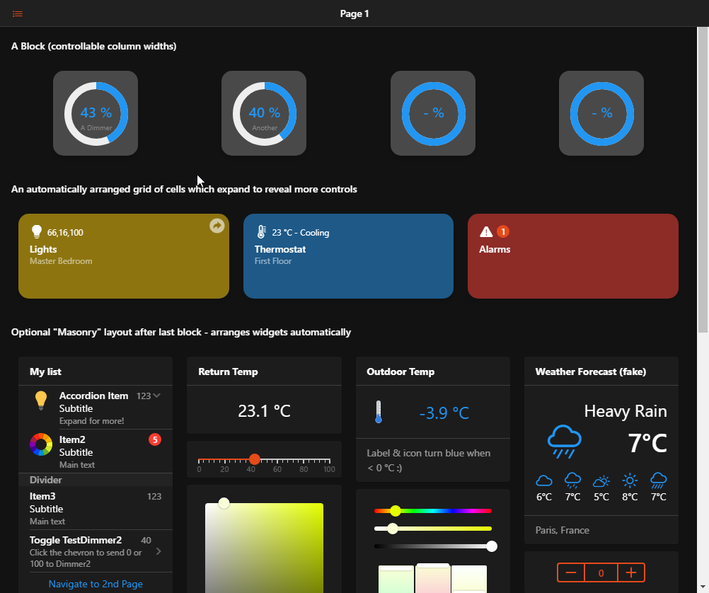
Layout Pages are used in the main web user interface to display widgets in an organized manner. You can choose between two different basic types of layouts:

  • Responsive Layouts

Responsive Layouts are the main layouts in openHAB and recommended for most uses. They automatically adjust to the device's screen and thus can be used as general interface from all devices. Within Responsive Layouts you can choose among several types of arrangements, based on whether you want to control the layout completely, or let the container decide where to place the widgets.

Responsive Layout Page Example

  • Fixed Grid Layouts

Fixed Grid Layouts allow you to create a Layout Page where elements have predefined positions and sizes. They are used to design a panel-like page for a specific screen size and are most suitable for static interfaces like wall mounted tablets.

When you first create a layout you are asked which type of layout you want to create. Note that the type cannot be changed afterwards.
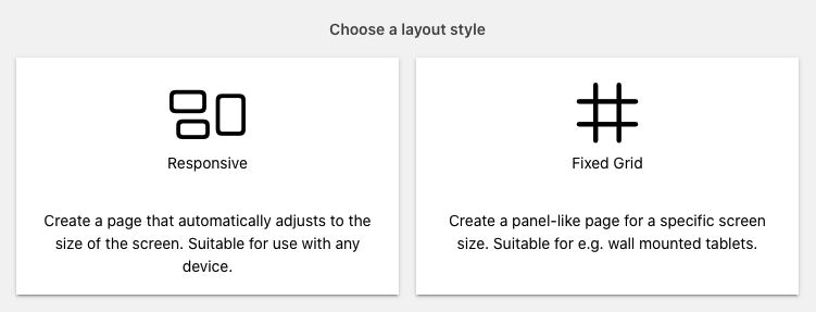
Choose Layout

# Responsive Layout Pages

# Anatomy of a Responsive Layout Page

A Responsive Layout page can host one or multiple blocks, optionally followed by a masonry layout.

In every block there could be an arbitrary set of rows or cells containers.

In a cell container, you may add widgets from the standard cell widget library (or personal widgets, provided they're based on a oh-cell widget or derivative).

In a row, you may add columns which will spread across the row, possibly wrapping their contents to another row (but still within the same oh-grid-row). Each column can host one widget from the standard standalone widget library, or a personal one.

The masonry container will decide how many columns it has based on the screen width, and will try to arrange the widgets automatically to form a compact layout.

# Designing Responsive Layout Pages

When you're designing a responsive layout page, it's important to remember how this page will be used. Sometimes, it will be on a phone, and other times on a bigger screen.

With that in mind, it is advisable to build the page for the narrow screens first, and then make sure it expands gracefully to the wider ones, instead of thinking the other way around. If you plan to share the UI you built, you can expect them to access it with mobile devices rather than desktop computers.

For cells and masonry, you don't have to worry about it, it will be handled for you. However, when you choose to keep control of the layout by making use of rows and columns, you need to take extra care about the responsive breakpoints.

These are controlled using the parameters on the column (oh-grid-col) components - you can configure them in the Design tab with the Column Options menu entries, or in YAML with the Code tab or a "Edit YAML" options on a parent component.

Column Options

Using code, you can quickly duplicate the breakpoints for similar columns.

The breakpoints work like this: the width property of the column is the default width that will be applied for the smallest screen, then xsmall, small, medium, large, xlarge width will apply on wider screens appropriately:

Property Minimum screen width Examples of devices
width No minimum, default All devices including phones
xsmall >= 480px Smartphones in landscape mode
small >= 568px Smaller tablets (Nexus 7...) in portrait mode
medium >= 768px Most tablets in portrait mode
large >= 1024px Smaller/regular tablets (iPad, iPad Mini...) in landscape mode*
xlarge >= 1200px High-end tablets (iPad Pro...), desktops

* Note that the sidebar will potentially be displayed and has a width of 260px

If you don't specify any width or breakpoints, the column will spread evenly on the row, without wrapping. This is fine for a couple of columns and simple widgets only, since on a small smartphone screen, you will rapidly get out of room. That's why you may find yourself wanting to let a column be 100% by default, so that it occupies the entire screen, and then reduce the width for medium or large breakpoints.

For example, given this set of rows & cols:

config:
  label: Overview
blocks:
  - component: oh-block
    config: {}
    slots:
      default:
        - component: oh-grid-row
          config: {}
          slots:
            default:
              - component: oh-grid-col
                config:
                  width: "100"
                  small: "50"
                  medium: "33"
                slots:
                  default: []
              - component: oh-grid-col
                config:
                  width: "100"
                  small: "50"
                  medium: "33"
                slots:
                  default: []
              - component: oh-grid-col
                config:
                  width: "100"
                  medium: "33"
                slots:
                  default: []

This is how the layout will adapt depending on the width of the screen:

Responsive Layout

# How to Build a Responsive Layout Page

# Defining the Layout

When you create a new Responsive Layout Page, you'll notice the 2 buttons Add Block and Add Masonry. Clicking either will add the respective container to the page. If you have multiple blocks, you can use the black context button (or the Code view) to reorder them with the Move Up/Move Down menu options. You can also copy it and paste it as another block after they've been designed, if you wish to have multiple similar blocks. You can also give a title to the block which will be displayed above it.

Blocks are also good candidates to use the conditional visibility features on, with the visible and visibleTo properties. You can restrict what's displayed on the page based on an expression, or who is currently viewing the page. In Design mode, you will not be able to see the effect of these properties, notably visible, but in Run mode they will be taken into account.

Under blocks, as explained above, you can have a mix of cells or rows. The 2 buttons Add Row and Add Cells will let you add more of them. They will be added at the end of the block, but as for the blocks themselves, you can reorder them, or duplicate them, using the context menus or the YAML.

In Design mode, rows will feature an additional step before you can actually add widgets: adding columns: the Add Column serves this purpose.

# Adding Widgets

Big gray placeholders with a "+" sign will appear where you can add Widgets.

Depending on the type of containers, different widgets from the Standard library will be offered in the menu, as well as widgets from your personal library.

You will also get an additional option: Add from Model.... This option will display your semantic model, and let you pick one or several items, then add them in the container. The Widget that will be added will be the default widget for the item for that type of container which can be controlled with metadata:

  • for columns or masonry, the default standalone widget;
  • for items inside list cards, the default list item widget;
  • for cell containers, the default cell widget.

Add from Model

REMARK

The widget that will be put on the page is a copy of the current widget as defined in metadata at the time of the addition; if you change this definition for an item, widgets that were already put on a page with the Add from Model... feature will NOT be updated.

# Fixed Layouts

Fixed layouts allow you to position and size widgets freely, either on a grid with Fixed Grid layout, or in a completely free way with Fixed Canvas layouts (with Fixed Canvas, you are still able to temporarily switch on a grid if you want to snap some widgets).

The first thing to do when creating a Fixed Layout is to define your screen size. In most cases this should be the CSS Resolution of the device you're creating this layout for.

Note

For most modern tablets, mobile phones and some other screens the CSS resolution is different from the physical pixel resolution (sometimes referred to as Retina displays). The user interface tries to help you determining the CSS resolution by showing the currently detected value as Current Screen rate at the top of the virtual screen area.

# Fixed Grid Layouts

To define your screen size open the '#' menu and click Configure Grid Layout.

The layout editor shows a gray surface as the virtual screen area, which represents your defined screen. You can now place widgets on that screen by clicking the Add Widget button. Just like with responsive layouts a placeholder will appear, allowing you to choose widgets from the library.

Additionally, you can move the widget within the virtual screen area by dragging its upper left corner at the arrow icon shown. You can also resize the widget by grabbing the handle at the bottom right corner.

Positioning and resizing will snap to the underlying invisible grid. The size of that grid can be adjusted by configuring the number of columns in the layout configuration. The number of rows gets automatically aligned to create the most square-like grid.

The gear icon on the top right corner of each widget allows you to configure or remove a widget.

# Configuration

The following parameters can be adjusted for a Fixed Grid Layout:

# Layout Settings

Number of Columns: Number of grid columns across the page. Defaults to 16. Limited to a minimum widget width of 50px (calculated from screen width, margin and number of columns)

Margin: Margin between items and to screen edge in CSS pixels. Defaults to 10.

# Screen Settings

Screen Width: Screen width in CSS pixels. Defaults to 1280.

Screen Height: Screen height in CSS pixels. Defaults to 720.

Scaling: Enabling this scales the defined screen to the width available in the browser window. All widgets are resized accordingly, with the margin staying fixed. While this works well in many cases, it can lead to unpredictable styling issues, especially on large divergence from the defined screen width. Defaults to false.

# Appearance

Hide Navigation Bar: When enabled the navigation bar on top of a page does not get displayed on this page. In conjunction with hiding the sidebar via its pin icon, this can be used for full screen display, e.g. in a fullscreen browser or when used as Home Screen App on iOS. Defaults to false.

Hide Sidebar Icon: With the navigation bar hidden, an icon is displayed on the top left corner when the sidebar is closed. Enabling this hides the icon. Defaults to false.

Show Fullscreen Icon: Show a fullscreen icon on the top right corner to enter browser fullscreen mode. Defaults to false.

# Fixed Canvas Layouts

To define your screen size open the canvas menu and click Configure Canvas Layout.

The layout editor shows a gray surface as the virtual screen area, which represents your defined screen. You can now place widgets on that screen by clicking the Add Widget button. Just like with responsive layouts a placeholder will appear, allowing you to choose widgets from the library.

Additionally, you can move the widget within the virtual screen area by dragging its upper left corner at the arrow icon shown. You can also resize the widget by grabbing the handles. Depending on the widget, you may also toggle the Autosize option in the widget options available from the gear icon on the top right corner of each widget to have the widget take its natural size.

If you toggle the grid using the grid button, positioning and resizing will snap to the grid but untouched widgets will remain at their current size and position. The pitch of that grid can be adjusted in the layout configuration.

The gear icon on the top right corner of each widget allows you to configure or remove a widget.

# Configuration

The following parameters can be adjusted for a Fixed Canvas Layout:

# Layout Settings

Grid size: Pitch of the grid when the editor grid button is enabled, in CSS pixels.

# Screen Settings

Screen Width: Screen width in CSS pixels. Defaults to 1280.

Screen Height: Screen height in CSS pixels. Defaults to 720.

Scaling: Enabling this scales the defined screen to the width available in the browser window. All widgets are resized accordingly. While this works well in many cases, it can lead to unpredictable styling issues, especially on large divergence from the defined screen width. Defaults to false.

Image URL: URL of the image to display in the background. The image is stretched to fit the screen size, while preserving its aspect ratio. If you want to achieve a different placement, adding margins to the image in an image editor will be necessary.

Image Source Set: The setting is passed to the srcset (opens new window) attribute of the image element, allowing to specify different images to be used depending on the actual resolution of the device, for example is the layout will be used both on a so called 'retina' and non-'retina' tablet.

# Widget Settings

Specific widget settings are available through the gear popup menu displayed on each widget in the layout. It provides access to the settings related to the type of the widget (Widget Settings) and to settings specific to the usage of this widget within a canvas.

# Container Settings

Preserve classic style: Enabling this option preserves the widget style definition as in other layout pages (responsive, fixed grid). Usually, this means preserving the background of the widget.

Shadow: Applies a shadow to the widget inner outline.

Bring to Front, Mode Up, Move Down, Send to Back: Change the drawing order of several overlapping widgets.