# oh-block - Layout Grid Block
# Usage / reference documents
Grids elements provide a way to organize and position other visual components on the page in relation to each other. Some of the key design concepts are explored here (print) (opens new window) or here (UI design) (opens new window).
In openHAB grid is used within layout pages to organize and align controls. Grids can also be used to layout the controls that make up a custom widget. Both layout pages and individual controls can be made responsive) (their design changes based on the screen size). A layout that is optimal on a mobile phone screen is often not on a laptop or large monitor.
Widget design
oh-block, oh-grid-row and oh-grid-col are used for layout page design.
These controls are not suitable when designing custom widgets.
Use the f7-block (opens new window), f7-row (opens new window) and f7-col (opens new window) to organize components in custom widget designs.
- Layout pages are discussed within the main documentation here.
oh-blockis the root a container object foroh-grid-row/oh-grid-colobjects (which in turn, host the controls that provide the user interface).- An
oh-blockis created in a layout page each time you click theAdd Blockbutton in the page design window. At least one block is required for each layout page. - You can view / edit the layout page code by clicking the
Codetab when in page design view (Administration/Settings/Pages).
- These components are based upon the corresponding Framework 7 (v5) block control (opens new window).
- Component styles are applied by the Framework 7 CSS variables (opens new window). Not all styles are implemented/available for use in this customised version of the control. For guidance on how to customise styles see the CSS Styles (opens new window) section.
TIP
Grid is not a table! Grid components are virtual containers, so you can not view them or add borders as you would be able to do with a HTML table.
# Configuration
# General
# title Title TEXT
Title of the block, displayed above it
# Inherited Properties
The configuration is passed to the underlying f7-block component from Framework7 v5, however there are no compatible scalar properties available, due to the application specific purpose for this control.
# Slots
# default
Hosts all child content to be placed within this container.
# Examples
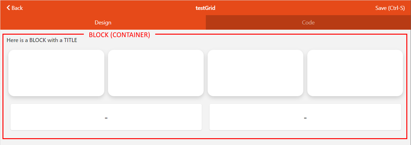
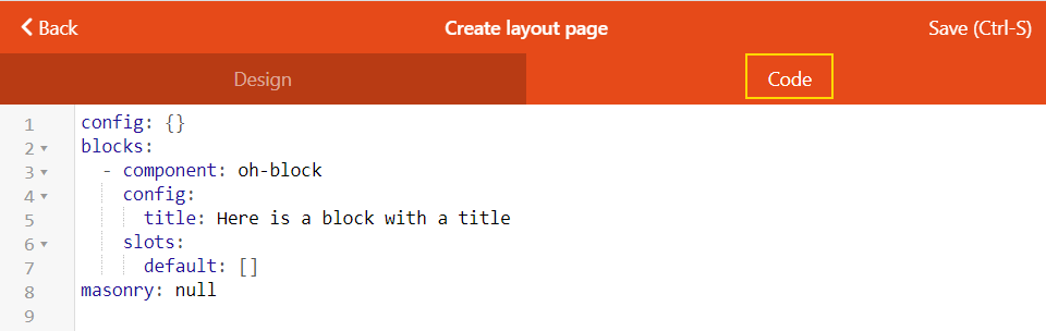
# Header Image Source Code
This example code generates the example block and grid image used at the top of this page:
YAML
config:
  label: testGrid
blocks:
  - component: oh-block
    config:
      title: Here is a BLOCK with a TITLE
    slots:
      default:
        - component: oh-grid-row
          config: {}
          slots:
            default: []
        - component: oh-grid-cells
          config: {}
          slots:
            default:
              - component: oh-cell
                config: {}
              - component: oh-cell
                config: {}
              - component: oh-cell
                config: {}
              - component: oh-cell
                config: {}
        - component: oh-grid-row
          config: {}
          slots:
            default:
              - component: oh-grid-col
                config: {}
                slots:
                  default:
                    - component: oh-label-card
                      config: {}
              - component: oh-grid-col
                config: {}
                slots:
                  default:
                    - component: oh-label-card
                      config: {}
masonry: []
# Community Resources
- Got a cool example from the Community pages? Use the GitHub edit page link to add links to this page!